
Here are the fabrics I'm using. They're all Kona Cotton Solids from Robert Kaufman (with a wide back from the Doe collection in the background).
It's about that time! It's time to start selecting fabrics for the upcoming Feathered Star QAL, if you haven't already. Find yardage requirements here.
First and foremost, I have to disclose that I'm a solids lover. I tend to gravitate to solids for many projects, not just feathered stars. I'm not exactly sure why this is... it feels like solid colors are easier for me to work with, but I don't think that's always been the case. Part of it is the longarm quilter in me (read: overquilter) who loves when her stitches SHOW. I know there is an appeal in solids not masking those quilting designs.
Another benefit of working with solids as it relates to paper piecing: you can't accidentally sew the wrong side! This isn't such a drawback to the experienced foundation paper piecer, but when a person it just learning, it's one more consideration that needs to be made.
Okay, phew! Now that I've written some of my reasons for choosing solids, it all seems a little better founded than just selecting solids on a whim.
But my goodness, there have been AMAZING feathered stars made from non-solid fabrics. Which brings me to a major downside of using solids: not using the fantastic, cute-as-can-be printed and designer fabrics that are oh-so easy to come by in our local quilt shops!
Check out this link to other feathered stars. Note to yourself what strikes you as being successful (or less so). Personally, I've found that strong contrast appeals to me.
Here's a star I made a year an a half ago. It was a slight departure from the No Y Seam Feathered Star, but I think it'll help to illustrate my point.
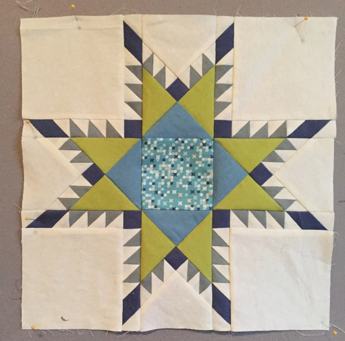
I attempted to have a "matchy" center. When I had my pieces sewn together, I pretty much hated it. There was not enough contrast and with the center square being the only printed fabric... well, I think it fell flat.
I decided to un-sew the center and tried a solid fabric with more contrast.
In my opinion, the second attempt is WORLDS better. I ended up setting this star on-point to make a wall hanging:

Ooops! I used all solids again. :)
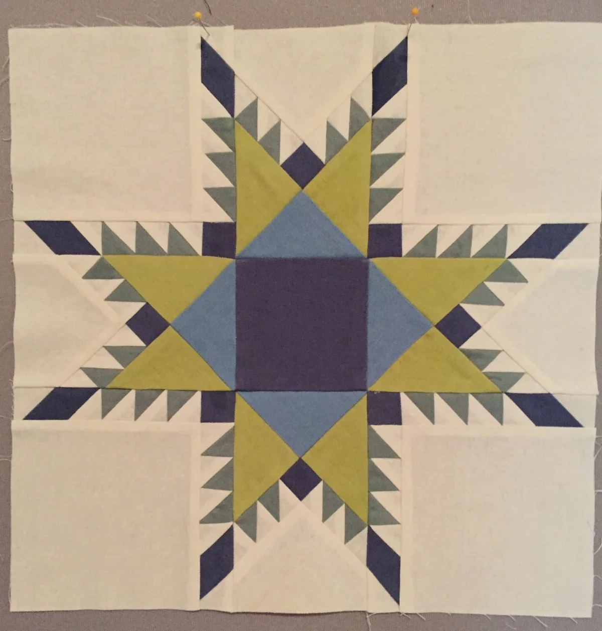
Here is one more example from my checkered feathered star past. (Ha!)

I use this example not in a "what not to do" sense, but in a way of preference. I actually like this block, and it gives me a chance to point out some other things to think about when you're choosing fabric for your feathered stars.
Contrast:
This block has contrast AND it has a "softer" feel to it. The star center, star tips, and capstone squares (my lingo, I don't know if these have proper terms) in teal have great contrast. They really jump out against the background and other star components.
The spines and the "star point" fabric are prints with similar tones to the background fabric. That's what gives it the softer feel. They are not well defined against each other, which brings me to...
Scale and size:
The spines are in a medium-scale print. The star shown above is an 8" block, so the spines are tiny! Any medium- or large-scale print that gets cut up into a 1.5" square and then cut in half diagonally is not going to retain the overall look of the print. But they can still be fun and pleasing to the eye!
Direction:
When studying the block above, I want to draw attention to the fact that two of the print fabrics are directional. Can you spot them? The background print–while it is small in scale–is also directional. Let your eye travel around the perimeter of the block to see how the direction of the tiny triangles in the print change. The other directional print is in the star points. It's a subtle print with series of lines. Generally speaking, when lines are involved, there's a good chance the print is directional.
As you can see, it wasn't important to me that all the directional prints were going the same way. Just like all the other considerations I've mentioned using fabric, these aren't a list of do's and don'ts, they are things of which to be aware.
Fussy cutting:
I speak with absolutely no authority on fussy cutting. HA! At least I can tell you when I have a blind spot. :) I just know it can be done. At this point in my life, I have no interest in it, but then when I see fussy cutting perfectly executed, I think it's the most amazing thing ever! The centers of these feathered stars make for a great opportunity to showcase a special fabric in a really special way.
My last tip on this subject is to use the Recolor app to test out your fabrics (colors) and contrast before you commit to them IRL. I've written about using the free app here. I still think that it's such a fantastic tool!
Also, if you have purchased the Feathered Star QAL, send me an email or get in touch with me on social media and I will send you the coloring page file for the whole quilt layout! Or you can find the single feathered star coloring pages on either the NYSFS or Fierce Feathered Star pattern listings.